Reading · two instruments, one labor market
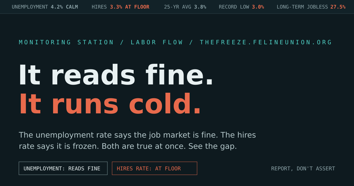
The unemployment rate says the job market is healthy. The hires rate says it is frozen. Both readings are correct at the same time, and that contradiction is the whole story.
Below are the two dials, side by side. One sits in the calm band. One sits against the floor. This page shows you why they disagree, using flow metrics that cannot be moved the way the headline rate can. It does not tell you the postings are fake. It shows you the gap and lets you hold it.
Listen · the panel read
A short desk conversation: an anchor, a labor-flow analyst, and a skeptic who holds the headline's nuance open. Jump to any chapter and the page follows along, scrolling to the section under discussion.
Voices are synthetic (fish.audio). The transcript is the page itself: every claim the panel makes traces to a plotted BLS series or a dated release below.
Core reading · is this normal or unusual
The hires rate is the share of employed people who were newly hired that month. It is a flow, not a headcount, so it cannot be held up by people who already have jobs. Here it is against its own 25-year average, with recessions shaded. Read where the current value sits.
Why the headline is the wrong instrument
The unemployment rate is a good instrument for some questions and a poor one for this. It fails on all three of the moves that let a headline number drift from the thing it names. The receipts below are from a single month, June 2026, when the rate fell to 4.2%.
The rate counts only people actively searching in the last four weeks. Someone who stops looking is not "unemployed" by definition. The count improves when they give up.
The rate is unemployed divided by the labor force. When people exit the labor force, the denominator shrinks, so the fraction can fall while the number of jobs falls too.
Because of the first two, the rate can move the wrong way. In June 2026 it fell to 4.2% while employment dropped and payroll growth was among the weakest of the expansion.
Reported, not asserted: every figure above is a published BLS release. The point is not that anyone falsified them. It is that a rate built this way can look calm while the flow underneath it seizes.
Cross-check · the metrics that move with conditions
Flows and ratios that do not depend on whether someone is still looking. Shapes are exact from the series; decimals are approximate.
CANADA · There is no monthly JOLTS-style hires rate for Canada. The nearest comparable published series is the StatCan employment rate (share of the working-age population employed), shown here at roughly 60.7% and easing from about 62.4% in 2023. Where a truly comparable series does not exist, this page shows nothing rather than a false match.
Correction · the claim you may have arrived with
A widely shared version of this story reads job openings sitting above hires as proof that postings are fake. Openings are a stock of unfilled positions on the last day of the month. Hires are a flow of people started during the month. A stock sitting above a flow is arithmetic, not evidence. The gap below is the historical norm; the property agrees with the correct read and drops the bad mechanism.
The Freeze is a monitoring-station readout, not a verdict. It plots published numbers and sourced figures and refuses the leap to intent. If a claim here is not a plotted series or a cited release, it should not be here.
SOURCES
· BLS JOLTS — hires rate, quits rate, job openings rate (series since 2001)
· BLS CES — nonfarm payroll change
· BLS CPS — unemployment rate, labor-force participation, long-term-unemployed share
· BLS LNS — prime-age (25–54) employment-to-population ratio
· StatCan LFS — Canadian employment rate
· OECD — cross-country comparison context
Honesty line: readings are annual averages, shapes are exact, decimals are approximate. The hires-rate series begins in 2001 because JOLTS begins in 2001; no earlier hires line exists and none is drawn.